A new pet project - Visualizing Strava history
If you’re into sports, you probably know Strava, the purest social media platform in the sense that you are not even trying to hide how you only upload things only to boast. If you participate in a society, you probably heard complaints about overly complex and extensive data protection regulations in the European Union. Today, I wanted to introduce a mini pet project that brings together the best of these two worlds (wow, sounds exciting). I love the EU data regulation, first and foremost, because it gives you the right to access all data a digital service provider, such as Strava, might have stored about you. Big tech might have your data, but at least you have it, too, and today, we are going to visualize it.
The idea is simple:
- I request my user data from Strava
- I wait (okay, I did 1. a while ago)
- I look at the data they stored about me and use it to create a map of memories of trips and activities I did through the years.
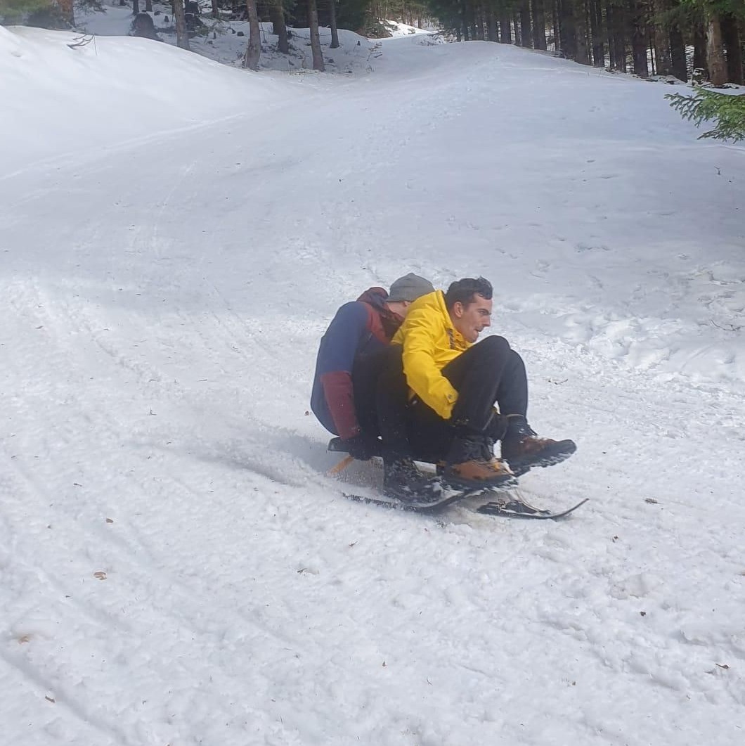
You might expect a catch here, but the whole thing was that easy. Once requested, the data comes within a couple of days, and wow, it is a lot. Strava stores not only records of your tracks but also which routes you planned, which segments you starred, if and where you declared privacy zones inside which your public records will be obfuscated, your mobile device IDs, times and IP addresses for all your login attempts, and every single image you uploaded. While a bit frightening, this is actually amazing because I didn’t have most of those on any physical device anymore, and I almost lost beauties such as this:
Anyways, the essential data (the GPS tracks) came in two formats: As plain .gpx files and .fit files. This is due to the device used to record the activity: I tracked with my phone but also various Garmin devices that use their own file format (that’s the .fit files). Fortunately, Garmin offers a Python library to decode and read these records. The rest was pretty simple: Combine some data sanitation in pandas with some custom preferences (like different colors for different sports), and plug it all into a generic pydeck layer.
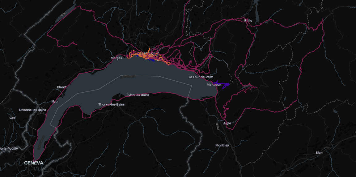
Above, you can see a screenshot of the HTML generated by the area around Lake Geneva. I lived there in 2020, and thanks to Covid, I was on my bicycle more than I usually would be in an average winter. Fun fact: I arrived for my semester abroad by bicycle, as you can see from the track coming in from the top of the map. Beneath cycling, I ran a lot (in the Lausanne area only), and I went on a hike next to Montreux. If you look very closely, you can even see my swim tracks in the lake, drawn in deep blue.
What’s next
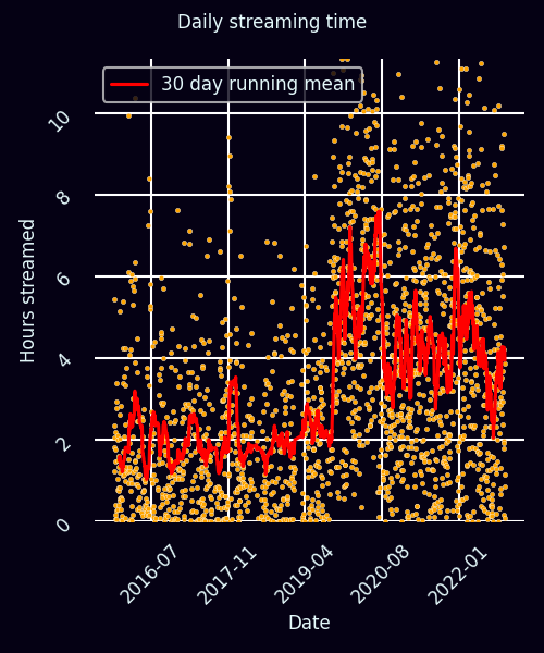
While this was kinda fun, the actual beauty of data lies in the things we can learn from it. I don’t want to kill the fun in sports, so I am not going to analyze my performance over time. However, it would be fun to see how my mood changes when I am more or less active, wouldn’t it? One of the best indicators I can think about is the music I listen to: Is it sad, is it happy, is it a lot, or do I prefer silence? Stay tuned (pun intended) because I already have my Spotify data. Sneak peek? There you go:
Code
The source code is available on my GitHub. Feel free to use it and contribute to this project. There are a couple of things to be included in the future, amongst others:
- Flyover visualizations like those done for Tour de France stages
- Show random pictures from the recorded activity on hover
- Interactive filters